Showing posts with label Prepress. Show all posts


PDF files are used to send print-ready data to printers. The file format is also frequently used for submitting adverts to publishers or as a graphic file format for logos and drawings. Even though the file format itself is reliable, PDF files can still be troublesome.

Common PDF errors or mistakes

In 2017 GWG, a graphic arts association, ran a survey regarding the use of PDF files in the graphic arts industry. Below are the main issues reported by the 1100 respondents. I’ve included how many people reported seeing each issue.
  1. The resolution of images is too low(70+%)
    Low image resolution leads to a loss of sharpness. When the resolution is really low images get a blocky or  ‘pixelated’ look and straight lines that are not perfectly horizontal or vertical will show a staircasing effect.
  2. Use of incorrect or unwanted color spaces (50+%)
    Many printers request CMYK files so any PDF file containing RGB or Lab data will be incorrect, even though modern workflow systems and RIPs are perfectly capable of properly processing such color spaces.
  3. Bleed is missing (50+%)
    Unless this is corrected a thin white line may appear between the paper edge and close by images or tinted areas.
  4. Fonts are not embedded in the PDF(40+%)
    This can lead to text getting printed with a wrong typeface. It can also cause the spacing of characters to be completely wrong, with characters partially overlapping each other while others have too much spacing inbetween them.
  5. There are problems with transparency (30+%)
  6. The PDF file contains an incorrect number of spot colors (30+%)
    Typically printers who ask for pure CMYK files get PDF files with spot colors in them. When spot colors are expected, the same color might appear twice or more, each time with a different name.
  7. There is an issue with overprint (30%)
    The inappropriate use of overprint is an issue by itself. In this particular case, we’re talking about there being a difference between the Adobe Acrobat preview (with overprint set to be honored) and the printed result. Issues with overprint can cause page elements to disappear or change color. Small text can become difficult or impossible to read.
  8. Total ink coverage is too high (30%)
    This can cause issues on press because the ink can’t dry properly. This can lead to set-off where the ink of a still wet area rubs off on whatever is stacked on top of it. Too much ink can also lead to muddy browns in neutral areas.
  9. Incorrect ICC profiles are used (30%)
    The use of incorrect profiles may lead to the colors of the printed result also being incorrect.
  10. The dimensions of the PDF do not match the requested size (30%)
    The PDF file format uses so-called page boxes to define page dimensions and bleed. These boxes are used to check if the PDF page size is correct, which sometimes is not the case. A typical example is a business card measuring 85×55 mm positioned in the center of an A4-size page. Obviously the worst problem to receiving a PDF file that has a different aspect ratio.
  11. There are issues with flattened transparency (30%)
    Flattening can cause thin white lines to appear. It can cause shifts in color or make text appear fat. Flattening can also cause white rectangles to appear in graphic elements such as artwork or images.
  12. Colors are not reproduced correctly(20+%)
  13. The output intent is missing or wrong(20+%)
    A typical example is the use of a US-specific output intent such as SWOP for files printed in Europe. This can lead to incorrect color separations
  14. The conversion of spot colors to CMYK differs from the expected result(20+%)
  15. Technical elements are not defined properly (20+%)
    A document may need to contain data for die cutting, embossing, spot varnishing or some other type of embellishment. A die line should, for example, be defined as a spot color named ‘dieline’ and set to overprint. If that is not the case, an operator needs to fix this manually or a new PDF file must be requested.
To a lesser extent people also reported issues with corrupted fonts, corrupt PDF files, incorrect CMYK separations, missing objects, RIP errors and incorrect use of layers.
Every item in the previous list, which was published in 2008, is also present in this new overview, indicating that the above issues are unlikely to be resolved in the near future.

How common are PDF issues

The above mentioned GWG survey also asked how often respondents encountered issues with incorrect PDF files.
  • 6% claim that over 90% of the PDF files they receive contain errors.
  • 17% report that between 50 and 90% of the PDF files contain errors.
  • 25%  report that between 10 and 50% are troublesome.
  • The remaining 52% report less or no errors.

Reasons why PDF files contain errors or are troublesome

One of the reasons why many of these problems go undetected is that designers have the habit of making proofs from their layout, checking those proofs and then creating PDF files. These PDF files don’t get looked at, they are sent straight to the agency or printer. It would be far better if designers created PDF files and then made a proof of these files. This way the consistency between supplied file and proof is much better!

Troubleshooting bad PDF files

Many of the above issues can be fixed with Adobe Acrobat Professional. For some problems having a plugin like Enfocus PitStop may make it easier to troubleshoot the file.
There are a number of prepress workflow systems that also offer built-in tools to correct PDF issues. The preflight engine of the Apogee Prepress workflow of Agfa Graphics is an example of such a solution.
Next to PDF files having some kind of issue, it can, of course, happen that a PDF cannot be ripped or rendered at all. Here are some typical things to try when this happens:
  1. Use PitStop or another tool to get rid of any irrelevant data in the PDF file. Delete forms, scripts, animations,… and then use ‘Save As’ to create a new clean PDF file.
  2. Refry the PDF file if you don’t have access to the source file(s).
  3. If you have access to the source file: clean it up and recreate the PDF: Make sure that any spot colors that are not printed as spots are converted to CMYK in the original file. Delete any unused data (stuff on the pasteboard, elements hidden underneath others, unused pages,… ) You also may want to merge layers, paths or channels. Then do a ‘Save As’ to create a clean source file. Export directly to PDF if the application has an option to do so.
  4. If the above fail and you have the source files, try recreating the PDF using a different procedure: if the problem file was created by exporting to PDF, try creating a PostScript file and distilling that. If the problem file was created using Distiller or Normalizer, try using ‘Export to PDF’.
  5. If everything else fails, try opening the PDF in Photoshop and saving it as an image. This operation converts all text to a bitmap so it really has a huge impact on the quality of the output but if everything else fails, this is your last resort.

If you have any question to ask on this article,  feel free to comment below and we will respond quick.


After Imposition, each parent-sheet-sized art file is split out into 4 separate files, one for each color of ink: Cyan, Magenta, Yellow, and Black (CMYK). From there, each separated file is laser-engraved onto its own printing plate to be installed into the printing press.
These thin metal plates are sturdy enough to be used for many thousands of printing impressions, yet also flexible enough to wrap around a rotating cylinder inside the printing press:

Don’t be fooled by the color: the coating on printing plates is blue, but this has no bearing on the color of ink the plate will apply.
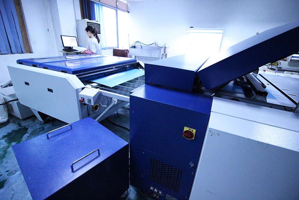
In the past, many printers used a photographic process to create printing plates, but these days most modern print shops use large Computer-To-Plate (CTP) machines like the one pictured here:
Computer-To-Plate Technology for Offset Printing Image Setter
First, a coated thermal plate is inserted into the CTP image setter (large compartment to the right in the photo above), where lasers are used to output the image by heating areas of the plate to different degrees depending on how much ink each area should collect. The plate rolls out of the laser compartment and moves through a special cleaning solution that washes away the heated parts of the coating, leaving a negative of the image to be printed.
Watch how your plate is rinsed to reveal your images.
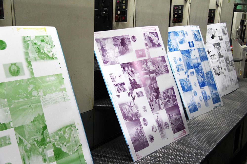
Remember, each parent sheet actually needs 4 printing plates, one for each color of ink to be applied. Below are 4 used printing plates that were just uninstalled from the press after being used to print a full-color parent sheet. It can be tricky to see which colors of ink are which due to the underlying blue color of the printing plates, but from left to right you can see the Yellow, Magenta, Cyan, and Black plates used on this print job.
All Four Offset Printing Plates For Each CMYK Color
Bonus Points:
Did you notice that this project has 16 pages per side for each parent sheet? Take another look!

There are several things you need to bear in mind when creating artwork. So we've put together some tips that will help you produce the perfect artwork file. We explain the aspects of colour, size, format, line thickness, margins and the right resolution for your image files. Now there's nothing stopping you from producing perfect artwork files!
Document colours
  • Prepare your files using CMYK as the colour mode, not RGB.
  • Avoid using 4c for black text; instead, set the font colour to 100% K.
  • When using special colours (Pantone or HKS), enter the desired values in the colour channel.
  • Instructions for special colours: To avoid mottled or patchy colours, areas with another process colour (CMYK) overlaying a special colour should be created using knockout rather than overprinting. Likewise, special colours over a CMYK colour should be knocked out.
  • If you order a greyscale item, the file needs to be created in greyscale.
  • We recommend creating grey areas in shades of black to ensure a perfect print result.
    Files in original size
    • Create your files in their final trim size.
    • If possible your files will be automatically scaled to fit the order format (without bleed). Please note that scaling a smaller format to a larger one can lead to a decrease in resolution quality. For example, scaling an A6 flyer to an A4 flyer can affect the quality of your final product. The lack of bleed on the outer edges can likewise lead to white edges around your product.
    The right trim allowances/bleed
    • To allow leeway for cutting differences in production, always add trim allowance to the size ordered:
    • Standard trim allowance: 2 mm
    • Envelopes: 1 mm
    • Ad technology products, packaging, presentation folders, clap banners and monthly calendars: 3 mm
    • Textile stretcher frames: 15 mm.
    • Do not use borders to frame the whole page. They can be partially cut, due to the mechanical cutting tolerance and can effect the appearance of the final product.
    Safety margin
    • Keep all contents at least 3 mm away from the edge of the finished size.
    • Contents in spiral bound calendars or brochures should be kept at least 20 mm away from the binding edge.
    • Make sure colours, background pictures and layouts extend into the bleed area so as to avoid leaving white lines as a result of cutting tolerances.
    Page numbers
    • For products with multi-page documents, create the individual pages in sequential order, starting with page 1 (front page) through to the last page (back page).
    • Check that all superfluous pages have been deleted.
    Images and graphic resolutions
    • Pictures, images and graphics: 250 dpi
    • Greyscales and colour images: 250 dpi
    • Line artwork (e.g. texts in a small font size and drawings): 1.200 dpi
    • Ad posters, advertising technology with text: 150 dpi
    • Advertising technology products: 72 dpi
    Line weights
    • Lines should be at least 0.22 pt.
    • Lines that are too thin are automatically increased to a printable weight. (Exception: lines set to precisely 0 pt. We cannot guarantee that the weight of these lines will be automatically inreased.)
    • Do not use borders to frame the whole page. They can be partialy cut, due to the machanical cutting tolerance and can effect the appearance of the final product.
    File formats
    • Always save your files in print-ready, uneditable file formats such as PDF (PDF/X1a or PDF 1.3), JPG, TIFF, EPS.
    • Do not use layers; reduce everything to the background layer.
    Embedded fonts or paths
    • Convert fonts to paths or embed them in the document to avoid tracking and printing problems.
    • Make sure there is sufficient contrast between background and font colours.

    Welcome to the first article in our “How to” series. The idea behind it is to offer you support in producing files for printing and also to give you a range of valuable background information. I’ll be taking a closer look at topics like image resolution, colour spaces, and typography.
    Depending on the format, and the type, and number of pages of your product, there are some details that you should definitely be aware of when producing files to print; today, I’d like to start by giving you some important tips about what is called bleed.
    Let’s start be clearing up the difference between the open and closed finished size. The open format is the completed product before folding. In this context, the finished size means that the product has been cropped and so no longer has any “bleed” (which is the term I will go into later in this article).
    The closed finished size describes the product once it has been folded: as an example, a 6 sided A5 portrait Z-fold leaflet measures 444 x 210mm in its open finished size, which results from 3 pages of A5, each 148mm laid side to side next to one another. Once it is closed, this A5 Z-folded leaflet measures 148 x 210mm.
    Bleed A5 folded leaflet z-fold
    Bleed A5 Folded Leaflet with z-fold (exterior)
    With one or two-sided products such as flyers or business cards, there is of course no difference between open and closed finished size.

    The basics of bleed

    In order to create some leeway for cutting tolerances in the production phase, the format ordered has to be extended by 2mm on every side, or the finished size will need to have this space added. This would mean that the A5 flyershown above would, before cropping, measure 448 x 214mm.
    It is important for the colours, background images, and the layout to be integrated into the bleeding area, meaning that all objects on the edge will be affected by the cropping. If you fail to provide bleed information, cropping can leave behind a thin line of white on the edge of the (unprinted) paper.
    You should also make sure that texts, images, graphics, and logos which you do not want cropped are far away from the edges; all elements which you do not want affect should be at least 3mm from the edge which will be cut later.
    Bleed A5 flyer
    Bleed A5 Flyer (front)
    You will find this, as well as a variety of further information about the bleed, summarised in our Artwork Guide.


    To lower costs and improve productivity printing presses do not print a single page or artwork at the time. In one single go a press may print 4, 16 or even 96 pages. Imposition refers the prepress process of positioning pages or artwork on press sheets in such a manner that the job can be printed and finished properly and efficiently. It is a fundamental step in preparing a job for print and it requires a lot of insight in the way the entire production process works. That means imposition is also handled differently for commercial, newspaper and packaging jobs.
    What is common for all three types of work is that the imposition work is not limited to positioning pages or artwork on a sheet. Part of the process is making sure that all the marks that are needed by the printing presses and finishing machines are added. This includes cutting marks, color bars and collation marks. All these production-related graphic elements are called the furniture.

    Imposition for commercial jobs

    Commercial printing includes producing catalogs, magazines, brochures, leaflets, flyers, stationery, business cards as well as posters and billboards.

    Imposing signatures

    For multipage documents such as magazines or brochures, all the pages are combined in signatures, which are printed sheets that are folded to the required page size.
    The example below shows an imposition scheme that can be used for imposing 8 A4 pages on an SRA1 sized sheet.
    Signatures contain multiple pages. An imposition scheme determines how those pages will be positioned on the signature. How many pages are combined, how these are positioned and which additional information is added to the signature is determined by many parameters:
    1. Page and sheet sizeOn a press capable of printing on SRA1-sized sheets, which measure 640×900 mm, you can put 8 A4-size pages. The ability to print 8 A4 or Letter size pages in one go is called an 8-up. There are 2-up, 4-up, 8 up,… devices.
    2. The number of pages of the printed product
    The compositor must determine how many sheets are to be printed to create a finished book. Some products, such as digitally printed
    3. Job content
    It doesn’t happen very often but sometimes the content of pages, such as large flat tints or dark images, require a change in the imposition template to make the job easier to print.
    4. Printing pressThe choice of printing press has a major impact on the imposition process. It affects both the work style and the position of the pages on the sheet.
    The work style
    The work style deals with the way the press sheets will be printed.- If both the front and back of the sheets need to be printed, you can make one set of plates for printing the front and one set of plates for printing the back. There are two ways to handle this:
    – If both the front and back of the sheets need to be printed, you can make one set of plates for printing the front and one set of plates for printing the back. There are two ways to handle this:- Sheetwise
    – Sheetwise
    The printer first prints the front, then removes the first set of printing plates from the press, mounts the plates for the back and sends all the press sheets through the press a second time to print the back.
    – Perfector
    Perfector is a variation on sheetwise. A perfecting press prints both sides of the paper in one go. You still need separate printing plates for the front and back but after the front has been printed, the press flips over the press sheet and prints the back.- Instead of making separate plates for the front and back, you can also combine both sides on just one set of plates. The first time the press sheets are fed into the press, half of the pages that are printed
    – Instead of making separate plates for the front and back, you can also combine both sides on just one set of plates. The first time the press sheets are fed into the press, half of the pages that are printed qre front pages, the other half are back pages. Then you flip the paper stack over and feed the pages through the press a second time. Once printed, the sheets are cut in half before folding, creating two identical copies. Depending on how you rotate the stack of press sheets, the work style has a different name:
    – Work and turn
    The axis runs perpendicular to the grip of the sheet.
    – Work and tumble
    The axis runs parallel to the grip of the sheet.
    – There are also a couple of special cases.
    – Come and goTo be documented
    – Cut and stack
    After all the pages have been printed they are stacked and then cut. There is no folding. Take for example a single copy single sided 100-page job that gets printed on a 4-up press: page 1 is on the top left of sheet 1, page 2 is on the top left of sheet 2,… down to sheet 25. Page 26 is on the top right of sheet 1, page 27 is on the top right of sheet 2, and on down the stack. A stack of 25 sheets is printed and cut so that you have a stack of pages 1-25, another stack of pages 26-50, a third stack of pages 51-75, and a fourth stack of pages 76-100. All that now needs to be done is putting the stacks in the proper order. Cut and stack is often used on digital presses. It is used for a variety of documents, including things like numbered tickets.
    – n-up imposition
    This is the simplest imposition method: pages are simply imposed in the order in which they appear in the original file. Even office applications like PowerPoint offer this type of imposition to output multiple slides on a single page.Sometimes binding styles are combined within a single job. This is called mixed binding.
    Sometimes binding styles are combined within a single job. This is called mixed binding.
    The position of the pages on the sheet
    Sheetfed presses have a grip: their clamps grab the paper to feed the press sheet through the press. That influences the distance from the bottom of the press sheet to the start of the first page.
    Press marks
    The control system of the press also dictates if registration marks, a colorbar and other elements need to be added to the sheet.
    5. The binding style
    Many publications contain so many pages that they are printed using multiple signatures. When there is no binding involved, such as with posters, inserts, business cards, or leaflets, this is usually called flat work.
    When a job requires multiple signatures, then how these signatures are bound also affects the imposition scheme. The two main binding styles are:
    – Saddle stitched binding
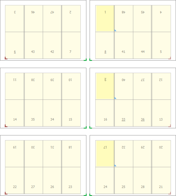
    All the sheets are printed and folded, after which they are inserted inside each other and one or more staples are applied to the spine. This means the first sheet contains both the first and the last page of the publication. The example below shows the front and back of the three signatures of an 48 page saddle stitched job imposed for an 8-up press.
    Imposition saddle stitched
    – Perfect bound
    All the sheets are printed and folded, after which the folded sheets are stacked on top of each other. Glue is applied to the spine and a cover sheet is wrapped around the book to encase the spine. The means the first signature contains all the pages from the first part of the publication. The last pages are on another sheet. The example below shows the front and back of the three signatures of an 48 page perfect bound job imposed for an 8-up press.
    Perfect bound imposition
    In some cases the imposition has to address physical properties of folding sheets, such as creep, bottling and web growth. In general, the bigger the signatures or press, the more these effects come into play.
    – Creep is also known as binder’s creep, pushout or thrust. It refers to the gradual extension of the inner signatures of a saddle-stitched job beyond the edges of the signatures that surround them. After cutting this means the inner signatures are less wide than the outer ones. To compensate for this effect, the content of the pages of the inner signatures is shifted slightly. This is called shingling.
    – One effect of folding a signature is that the pages might bottle: they get rotated or skewed a bit. This is mainly an issue with very large signatures that get folded a lot. To compensate for this effect the pages are counter-rotated a tiny bit in the imposition program.
    – While paper travels through the press, it can get stretched or deformed. This effect is called web growth and it occurs mainly with large thin or lower quality rolls or sheets of paper. The deformation can happen across colors (on the magenta cylinder, the paper is wider than on the black cylinder) or it can even happen within one single separation (the leading edge of the sheet is slightly smaller than the trailing edge). On web presses paper stretches across the web. On sheetfed presses the deformation is mainly in the direction of paper travel. The deformation can be linear, non-linear, trapezoidal or pillow-shaped. High-end imposition software can compensate for web growth.
    6. Binding equipmentTo be documented
    7. Cutting equipmentTo be documented
    8. Paper grain
    The fibers in many paper types are aligned in a specific direction. When pages are folded, this is best done parallel to the paper grain. That means the direction in which pages are oriented on a press sheet is partly determined by this grain. This does not mean all the pages are oriented in the same direction. Pages are frequently positioned head-to-head.
    Sometimes the paper grain is irrelevant or not an issue (e.g. when printing cards)  which means a sheet can be filled with pages that do not all have the same orientation. That is called a dutch cut.

    Step-and-repeat & ganging

    When a single job is repeated multiple times on a press sheet, as is often the case with small documents, that is called a step-and-repeat job. When multiple jobs are combined on a single press sheet, that is called ganging. A typical example is filling a press sheet with business cards.

    Imposition software

    Imposition used to be a manual process but nowadays it is handled by software.
    • There is dedicated stand-alone imposition software such as Kodak Preps, Dynagram Dynastrip or Ultimate Technographics Impostrip.
    • In some workflow solutions such as Agfa Apogee Prepress there is a dedicated module, Apogee Impose, to take care of imposition pages.
    • There are plugins for applications like Acrobat. Quite Imposing is a popular one.
    • Some people impose pages in a layout application, for example by creating a large page in Adobe InDesign into which they import PDF pages which are then manually positioned correctly.

    Imposition for newspaper jobs

    Imposing newspaper pages is less demanding than imposing commercial printing jobs. Newspaper web presses are large but the plates are usually small and multiple plates are mounted on each cilinder. These newspaper plates contain either one or two newspaper pages. When two pages are combined on a single plate, that is called page pairing.
    In CtP systems loading and unloading plates takes time, so that are some newspapers that use large plates, image multiple pages on a single plate and then cut up the printing plate to create smaller newsletter plates. This obviously means that the imposition template needs to be adapted and registration marks need to be added for the automated cutting system.

    Imposition for packaging jobs

    In packaging a single artwork or variations on the same artwork are typically repeated multiple times. Since boxes usually have an irregular shape, the artwork may need to be interlocked to minimize waste. That is called nesting. When the nesting is done based on the actual die cutting data, it is called true shape nesting.

    Other sources of information

    Wikipedia has an article on imposition.


    Preflighting is the process of checking if the digital data required to print a job are all present and valid. Nowadays it are usually PDF files that are sent to a printing company. The PDF file format is a solid standard to exchange pages, ranging from single ads to complete publications. Using PDF is, however, no guarantee that the receiver of a file can actually output it as intended. To make sure that a file matches the requirements to reproduce its correctly, it needs to be checked or ‘preflighted’. This page provides an overview of
    • the reasons to preflight files
    • the tools that are available to check page content
    • who should do the check and when it should be done
    • which settings are best used
    In case you wonder: the term preflight was derived from the long list of checks that pilots have to complete before taking off with an airplane.

    Why preflight PDF files?

    Checking files is essentially done to avoid problems in processing or printing content. If you look at the list of the 10 most common problems with PDF files, half of them can easily be avoided by preflighting all files. Enfocus published a nice infographicabout the 10 reasons to preflight files.

    How to preflight PDF files?

    There are a number of preflight solutions on the market.
    • From version 6 onwards Adobe Acrobat Professional includes a preflight engine. With each new release, this option has been improved and it is actually pretty powerful in Acrobat 9.
    • There are several preflight plug-ins for Acrobat. The best-known ones are Enfocus PitStop and callas pdfToolbox.
    • There are also stand-alone preflight applications on the market. Some like Enfocus PitStop Server focus specifically on checking PDF files. Others like Markzware FlightCheck can handle a wider range of file formats.
    • Many prepress workflow systems, such as Agfa Apogee Prepress or Kodak Prinergy, include a preflight engine. It is either a module which was licensed elsewhere or the vendor’s own development.
    Which engine you choose depends on the level of automation that is needed, the different types of files that the engine needs to be able to handle, the platform on which the application should run (Mac, PC,…) and the available budget. It is a good idea to use a solution that has been certified by GWG and appears in their application list. This way you are certain that the preflight system can correctly handle general market requirements.

    Who should preflight when?

    The earlier in a process that problems are detected, the easier and cheaper it is to fix them. This implies that designers should preflight their creations before sending them to their agency or printer.
    Printers or service bureaus should always preflight incoming data, simply to make sure that the quality of the product that they will deliver meets the customer’s demands.
    It is worthwhile to know that there are two technologies available to ensure that files only need to be preflighted once. These are Enfocus ‘Certified PDF’ and the Ghent Workgroup ‘Universal Proof of Preflight’. Essentially both systems allow a preflight application to embed metadata in a checked PDF to document how the file has been checked. The receiver of such a file only needs to verify if this ‘seal’ is present.

    What needs to be checked during preflight?

    The things that need to be checked in a file depend on its intended usage. This means that it is impossible to provide one single set of rules that apply to every possible type of job or printing. Below is a general description of what should be checked and why it is checked, including the reason why each check is done. The overview is inspired by the GWG v4 specifications, as far as I know the only international standard that describes the requirements of print-ready PDF files. I’ve simplified their recommendations here and there to keep the overview from getting too long.

    General file settings

    • The PDF file must be a certain version. This is done to avoid that someone uses a brand-new application to create a PDF that no-one else’s system can read yet. The GWG-specs recommend that the PDF is PDF/X-1a:2001compatible. This means that the file must be a PDF 1.3 or 1.4 file. These PDF versions have been around for more than 5 years so compatibility should not be a problem.
      • An unfortunate side effect of insisting on PDF/X-1a compliancy is that files cannot contain transparency. If a designer uses transparency in a layout, most printers with modern workflows actually prefer to get a file that has not been flattened and still includes all transparency information.
      • Another unfortunate restriction of PDF/X-1a is that layers aren’t allowed to be used. The use of layers is once again something which a lot of printers would actually allow for multi-language jobs or other types of versioning.
    • There are a number of compression algorithms for PDF files. Some of the newer algorithms may pose problems in older workflows so it is best to check if this is the case. The PDF/X-1a file format that GWG recommends to use already includes a number of restrictions on the types of data compressionthat can be used.
    • PDF 1.6 and later have a page scaling parameter which should not be used. To keep things straightforward, it is best to assume that a file is created 1:1 unless there are clear guidelines that are known by all parties involved.
    • A PDF file can contain custom halftone definitions. Since such a definition can lead to output at the wrong screen ruling or with the wrong dot shape, it is better to check that the file has no custom halftone data.
    • PDF files can contain annotations. Preflight needs to make sure that there are no annotations in the TrimBox. GWG also recommends to only allow annotations of the following types: Text, Link, FreeText, Line, Square, Circle, Highlight, Underline, Squiggly, Strike-out, Stamp, Ink, Popup, FileAttachment and Widget.

    Page specific settings

    • Page dimensions are described internally in PDF files using the so-called page boxes. Since it is not always possible to make sure that the PDF TrimBox actually equals the finished trim size of a publication, GWG sets no rules for the correct use of these boxes. They do recommend to check that no CropBoxis present and that there are no page elements beyond the MediaBox. The first requirement ensures that users see the full page in Acrobat while the latter makes sure there is no useless ‘crap’ present in the PDF.
    • The page size and orientation (as defined by the TrimBox) for all pages of a PDF file should be equal.
    • Sloppy designers sometimes leave empty pages in their design. When each section of a book is a separate PDF file and one of these accidentally contains an empty page at the end, this can completely screw up the job. To avoid this, check that there are no empty pages in the file.
    • When PDFs are used for advertising, it makes sense to only allow 1 single ad page per PDF. This ensures that agencies do not group multiple ads in a single file, making it too easy to accidentally place an incorrect ad.

    Text

    • Files should not contain black text that is smaller than 12 points and set to knock-out. This is necessary because it is very difficult to print such text. Even the smallest alignment problem on the press can cause such text to become illegible.
    • Check if the PDF contains white text set to overprint. Such text may be visible when the text is watched on-screen but it disappears in print.
    • Very small text quickly becomes either illegible or difficult to print when it is colored. GWG recommends to flag any files with text smaller or equal to 5 points (8 points for newsprint). When it is colored with 2 or more colorants, text should not be smaller than 9 points (10 points for newsprint).

    Fonts

    • All fonts should be included in the PDF file. This is done to avoid that an incorrect font is used, which could lead to text becoming illegible or part of the text disappearing. The GWG-specs are based on PDF/X-1a and font embedding is a requirement of this file format. PDF/X-1a also dictates that OpenType fonts should not be embedded directly. Designers can use OpenType fonts in their layout but the application that generates the PDF should embed these fonts as either Type1 or TrueType (CID or simple fonts).
    • When a certain font is not available during the PDF creation, it typically gets replaced by Courier. To avoid printing a PDF with missing fonts, check that no Courier font is present in the file. Designers who want to use Courier on purpose can use variants like ‘Courier New’, which are not flagged during preflight.

    Images

    • Images need to have a certain minimum resolution to be printed at a good quality. The required resolution depends on the type of printing. That is why the preflight process should check if all image resolutions exceed a minimum threshold value. GWG recommends rejecting files containing color and grayscale images with a resolution below 100 ppi for newsprint and 150 ppi for commercial offset work. For 1-bit images anything below 550 ppi is considered unacceptable. Many preflight applications can already give a warning when the image resolution gets dangerously close to these minimum values.
    • Images that have a resolution that is too high lead to bloated files that take longer to transmit or process. For newsprint GWG sets the maximum resolution to 300 ppi for color or grayscale images and 1905 ppi for 1-bit images. For commercial print using offset presses, the maximum resolution is set to 450 ppi for color or greyscale images and 3600 ppi for 1-bit images. Defining a maximum resolution is somewhat controversial: if this problem gets resolved by downsampling images, this can cause issues with special types of images such as security elements. Some users also argue that large file sizes are no longer the problem that they once were. From their point of view, the risks of downsampling exceed the advantages of limiting the file size.
    • By checking if white line-art is set to overprint, you avoid that such images disappear on the final output.
    • Theoretically, it is possible to put images that use 16 bits per channel in a PDF file. This leads to bloated files that may cause rendering issues on older RIPs, without any real-world advantage in printing quality. Preflight can make sure no 16-bit images are allowed.

    Artwork

    • If a design contains very thin lines, these may disappear on the printed result. Therefore it is best to check the minimum line weight, which depends on the intended printing process. For newsprint and commercial offset printing, a minimum line thickness of 0.125 points is required. For screen printing, 0.15 points is required.

    Color

    • Check if grayscale objects aren’t set to overprint. Overprinting grayscale objects can lead to excessive ink build-up, not to mention that the graphic sometimes becomes soo dark that it cannot be distinguished from the background anymore.
    • Total ink coverage is another important aspect of preflighting. As a general rule, newspaper jobs shouldn’t have any object in them for which the ink coverage exceeds 245%. For commercial printing on offset web presses, the ink coverage of any element should not exceed 305% while for sheetfed presses or screen printing that percentage is 340%. If CMYK text contains over 85% black ink, the total ink coverage of the text should not exceed 220% (newspaper) or  280% (web or sheetfed offset and screen printing).
    • Even worse than having to cope with heavy ink coverage is dealing with text or other objects that are 100% of each printing color. Having to print 100% cyan on top of 100% magenta, yellow and black leads to smudging and the need to frequently stop and clean the press. Hence the recommendation that any object inside the TrimBox should not use the separation colorspace ‘All’.
    • When a job is meant to be printed with spot colors, it is obviously that spot colors are allowed in a PDF file. Next to the presence of spot colors, it is best to put restrictions on their names (no confusing mix of suffixes, such as a file containing ‘Pantone 638 C’, ‘Pantone 638 CVC’ and ‘Pantone 638 CVU’) and color definitions (A PDF might contain a spot color which is defined as being 43C & 68M on one page and 40C, 63C, 2Y, 4K on another).
    • A PDF/X file contains an output intent, which is a description of the intended color space when the file is printed. GWG recommends that this output intent is an embedded ICC profile, which is part of their series of recommended profiles.


    What is Prepress?


    Prepress is the term to describe all of the processes that occur before printing and finishing. Since many publications nowadays are published both in print and electronically, many refer to the shared processes as premedia services instead.

    Overview


    are listed below may take place at one single location, such as a large publishing and printing company, or at a variety of places. Usually some tasks happen at a publisher while others take place at a printer or a dedicated prepress company (which are sometimes referred to as service bureaus or trade shops).

    • Design: Since the advent of desktop publishing, many people in the printing industry no longer consider design to be a prepress task. The design process includes:
      A CtP operator making plates while a colleague prepares another job
      • Preparing data, which includes copyediting and product photography, such as for a mail order catalog.
      • Creating the layout is done using one of the leading design applicationsuch as Adobe InDesign or QuarkXPress. People outside the graphic arts community may use tools like Microsoft Office or Publisher. There is also a wide range of specialized applications for tasks like database publishing.
      • The correction cycle includes processes such as proofreading and image retouching, for which Adobe Photoshop is the leading application.
    • Preflighting: Before finished pages go through the remaining processes, a validation is done to check if all the data meet the necessary production requirements.
    • Proofing: During the design phase there are already page proofs being created. Proofs are usually also made by the company that is responsible for the printing. This can be done for internal checks of the impositioning (imposition proofs) as well as for their customer who needs to sign off the proofs for approval. More and more such proofs are softproofs that are evaluated on a monitor. Hardcopy proofing remains popular when there is sufficient time for it and for color critical or expensive jobs.
    • Imposition: Depending on the final output device a number of pages will be combined into signatures.
    • Output to the final output device such as a digital press, filmsetter or CtP device. To output data, pages or complete flats have to be ripped or rendered. This process usually also includes:
      • transparency flattening: transparency effects such as drop shadows behind text need to be resolved.
      • color separation
      • color management
      • trapping
      • screening
      Some people prefer to delay the above destination specific conversions to the very last moment. This is commonly referred to as late binding. Once a job is printed, its data usually go into an archive.
    Many of the above steps are nowadays heavily automated, by either stand-alone applications or prepress workflow systems. The automation also allows for more elaborate communication processes:
    • Exchanging data such as the final layout may still happen using a physical carrier such as a DVD. In the past people usually submitted the native data, meaning the original layout file(s) and all associated images, fonts and other data. Nowadays PDF files are often used instead.
    • Increasingly the internet is used for submitting jobs.  This is referred to as web-to-print.
      • When the data exchange focuses purely on page content, solutions range from using an FTP server or e-mail system to using file sharing tools such as DropBox or YouSendIt. A more sophisticated web portal can add functions such as preflighting and page approval.
      • digital storefront enables a printer to not just capture page content but also order related information. Such a system can also facilitate reorders and allow print buyers to customize documents on-line.
    • Job-related data such as the job ID or run length are exchanged between systems such as an MIS (Management Information System), a prepress workflow, press control system and finishing equipment. Protocols such as JDFallow systems from different vendors to exchange the necessary data.
    • Many projects nowadays are published using other media besides print as well. The content of a magazine may also be published on the web while the content of a book is repurposed for e-books. There are special tools and protocols such as XML to facilitate cross-media publishing.

    Working in prepress

    Over the past 20 years, employment in prepress has declined rapidly due to the increased use of computers and software automation. This trend is not likely to continue – in the Nigeria job market employment in prepress is expected to increase  16 percent from 2010 to this present day, going from 119,000 workers up to 1000,000 especially due to rapid growth in large format printing industries.
    Powered by Blogger.