When it comes to file preparation of large-format imaging, there’s a different mode of thinking. The traditional rules of file dimension and resolution used in standard offset printing don’t necessarily apply. Where traditional print methods have you working in the 300-dpi (dots per inch) range, large format basically reverses that thinking altogether. This is where a number of traditional print designers and desktop publishers find themselves in unfamiliar territory. There’s a common misconception that bigger files need more resolution than normal print jobs—this is simply not true. All this does is give you a really huge file size. The Eye Plays Its Part When you’re getting started on a large-format project, the very first thing you must consider is how you got into this mess (just kidding)! No, you must first consider the viewing distance, which is perhaps the most critical aspect of how you go about preparing your file. When I was working in large format several years ago, this was always one of my first questions to the client. So let’s consider the aspect of “viewing distance” for a moment.
The human eye is a curious and fascinating piece of biology: perhaps one of our most sophisticated and, at the same time, one of our most flawed organs. That’s because the human eye is easily fooled, especially when it comes to viewing color and tones. Consider a rainbow, for example: When you see a rainbow in the sky, it really isn’t there. The mist in the air from a rainstorm is bending the light that’s passing through it (like a prism), which in turn makes the spectrum visible. But here’s the kicker: It’s only visible to a processing system like the human visual system, which can detect the sporadic wavelengths of light and generate the multicolored rainbow that we all know. The point is that our visual system is responsible for meeting us halfway by processing and rebuilding what we see. Everything we see in the world is merely reflected or transmitted light. The dimension and color of objects is the result of varying wavelengths of light that enter the eye.
Detail is lost, however, in an object seen at a great distance because, as your angle of vision to that object becomes narrower, the eye cannot distinguish details, and simply clumps them together. The science of a large-format imaging exploits this visual phenomenon to achieve its apparent clarity.
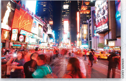
Say you’re driving down the interstate and see a really cool billboard with a seemingly sharp photo. You may be surprised to know that if you stood 3′ away from that billboard, you would see that the image is made up of very large scattered dots and the image itself is barely distinguishable. Yet from 50′ or more away, it appears sharp and colorful. Why is this? It’s because the clarity of this image relies on the functions of the human visual system. The farther we are from the image, the narrower our angle of vision becomes to that image and the dots appear to combine, resulting in a sharp image. Conversely, as we get closer to an image, we can see more details and the dots making up the image become visible. So the closer an image is to be viewed, the more resolution or dots per inch (dpi) are needed to make the image appear sharp and colorful.
Try it yourself: When you’re out in the world, get really close to a large print and examine the quality. It most likely doesn’t look that great. Then move away and look at it from a normal viewing distance. Simply put, the perceived resolution decreases the closer we are, and increases as we move farther away.
It helps the large-format designer, therefore, to be aware of the human visual system. When you find yourself in heavily populated areas (big cities), take a really good look at the billboards, bus wraps, and mural prints and think about where they’re located. The production artist has considered the location and set up the file accordingly. If a large mural print is at eye level, then it’s been output at a higher resolution than say, a billboard that’s 100′ in the air. Yet somehow they both have the same sharpness and detail. That’s our remarkable and flawed human eye at work.
File Preparation So why does the preparation of files for large-format output seem to have traditional print designers scratching their heads in perplexity? Let’s consider how viewing distance factors into how we set up a Photoshop file for large-format output.
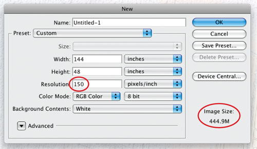
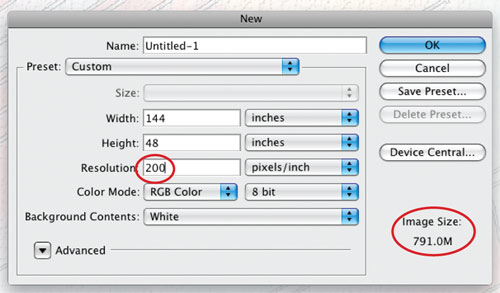
Let’s say that we have a client who wants a 4×12′ full-color banner with photos and text. The first thing to consider is: Where is the final image going to be located and how far is it going to be viewed from? Well if it’s going to be viewed from less than 3′ (like a wall mural), then we’re going to need some detail in there—around 150–200-ppi (pixels-per-inch) Resolution. So a Photoshop file at 48×144″ and 150–200-ppi will give us a file between 400 and 800 MB. That’s a lot of data because there are so many dots in a single square inch.
Now if the image is going to be viewed from a considerable distance—say 10′ or more—then we can certainly decrease the resolution to around 100 dpi. Now you’re looking at a 200-MB file. On some occasions, you can go even lower than that. This is where some designers start to get nervous, but they don’t need to worry. Just remember that the dot size is relative to the viewing distance. The closer your viewer will be to the image surface, the smaller the dots need to be; the farther away he is, the larger the dots. Relative to your eye, the dot is the same size.
Just to give you an idea, a friend of mine recently completed a banner print that was 6×84′ and he set the Photoshop file at 20 ppi (he could get away with this because the banner was going to be viewed from 25′ or more), which resulted in a file size of approximately 85 MB. Now that’s a much more manageable size of document. That same file at 300 ppi would create an 18-GB file!
You can also keep in mind that if you’re using Photoshop to build your large-format file, Photoshop will only handle a maximum pixel dimension of 300,000×300,000. And since Photoshop CS, there’s a large-document file format designated PSB, which will support your large files while maintaining layers, styles, etc.
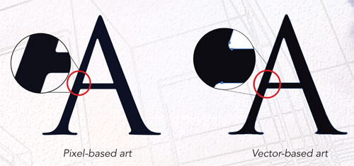
What about Adobe Illustrator? We know that Photoshop is a pixel-based application, which means that it’s resolution-dependent (you may have heard that term before).
On the other hand, Illustrator is a vector-based application, which means that it’s resolution-independent. Vectors are geometric shapes based on mathematical equations, which means that they can be scaled to virtually any size without even the slightest loss of quality. So if you can get away with designing for large format with all-vector art, you’ll get very high-quality art and a very manageable file size. Here’s the caveat: This only applies to vector art. Yes it’s true: You can import raster- or pixel-based art into a working Illustrator file but this would be a resolution-dependent element that will print using the resolution settings from the original file. Also, embedding raster art in an Illustrator file will result in a ridiculously huge file size, which will take much more time to RIP (see “RIP What?” below). So you’ll want to use Illustrator for sharp, clean graphics and text and Photoshop for photos and continuous tone images.
What Do I Save the File As? Well most typically, a TIFF or EPS file would be the preferred format to save to, but you’ll want to contact your printer to determine their file specs. And always save a copy. Don’t flatten your original file and then send it to print. Always keep an editable version somewhere. Believe me, you don’t want to have to rebuild a bus wrap design.
Of course, if you’re looking to outsource your project to a large-format printing company, they’ll always be happy to answer your questions. You should always find out what type of printer they’re using and how they want the files set up. The more they can sort out on the front end, the less difficult the job is on the back end, and then everyone can see the big picture.
There’s a wealth of information on large-format printing but we could only fit a few of the basics in this article. My hope is that this has provided a good primer for you to approach a large-format project with a little less confusion.
When I was starting out in graphic design, without a doubt the most terrifying and intimidating aspect of the job was preparing and sending my work to print.
Sure, your layouts might be tip-top and your typography skills may well be 'awesome', but all of these skills will mean next-to-nothing if the printed result comes back looking less than perfect. And there's sadly no 'Undo' option once that delivery box arrives.
But don't panic! In this article we’ll walk through a handy checklist of the principal things you need to think about when preparing artwork for print. Break down some of those knowledge barriers between graphic design and printing, and feel confident in creating documents that look as good on paper as on your screen!
1. Prepare Your Document for Print
You can start to prepare your document for print right at the start of the design process—when you set up your document on the computer.
Choose Your Software Wisely
First up, you need to consider which software application you’re going to use to prepare your print document.
There are a number of choices available, and it’s really up to you which program floats your boat! Adobe InDesign, Microsoft Publisher, CorelDRAW and QuarkXPress all allow you to set up flexible layouts and optimise them for print.
Include a Bleed!
I wonder how many times a year (or month, day even!) a printer has hung his or her head in despair at receiving a ‘print-ready’ file that lacks a bleed. Probably a lot.
Help your printer out and be sure to include a bleed (and export it! [see below]) when you set up your document on the computer.
So, what’s a bleed? A bleed is an extra space around the perimeter of your layout that extends past the edge of the page(s). You should always include a bleed if any elements (e.g. images, colored backgrounds) on your layout will cross the edge of the page (the trim edge). Once the layout is printed and trimmed, a bleed will minimise the visibility of any slight errors in trimming.
Do You Have Folds?
You might be creating a document which is going to be folded after it’s printed, such as a leaflet or brochure. Make sure you know exactly where the fold(s) are going to be (and drag out guides onto the digital layout to mark them out) when you set up your document.
Tip: If you’re creating a tri-fold brochure (which has two folds on a page, effectively ‘splitting’ the brochure into three parts), make sure you double the margin space across a fold. If you include the same margin as you do around the edge of the page, the fold will slice the margin width in half, giving the layout a cramped, uneven appearance once folded.
How Will It Be Bound?
If you’re designing a multi-page document for print, such as a book, booklet or report, you need to think about how the pages will be bound together once printed. Talk to your printer to help determine what sort of binding will best suit your print product. Depending on the number of pages and paper weight, as well as the desired ‘look’ of the final bind and your budget, the printer can suggest an option(s) which will suit your design.
There's a huge range of different binding options available, just some of which are: saddle-stitch, velo, fastback, Wir-O, perfect, side-stitch, case, sewn-and-glued, and lay-flat. Some printers may refer your product to a specialist binders, if they cannot offer a binding service in-house.
Set Up Reader’s Spreads, NotPrinter’s Spreads
If you’re creating a multi-page document, such as a book, for sending to print, you may be tempted to visualise how the book will actually be printed, and in many cases you’ll notice from hard-copy examples that a page in the first chapter of a book might actually be physically connected to a page in the last chapter, forming a single spread.
This may be the case, but that doesn’t mean you should set up your document in this way, as ‘Printer’s Spreads’. It’s much easier, both for you and the printer, if you set up your document as ‘Reader’s Spreads’, i.e. how the reader would actually view the document: page 1, then page 2, then page 3, etc.
Let the printers do their job—they will be able to arrange your print-ready file in the way they feel best. And as a bonus, you’ll spare everyone a whole lot of confusion and bafflement as you try to explain why page 2 is opposite page 15...
Include Blank Pages
It’s quite common for multi-page documents to contain some blank pages, whether it’s a few pages at the beginning of a book, or the reverse side of some pages in a report.
You should make sure to include these when you set up your document. True, they don’t contain anything to be printed, but including them will help your printer understand the structure of the document, and accommodate any blank pages you want included in the final print product.
2. Get Savvy About Color
Color is the beating heart of the print process. Having a basic grasp of the main color rules for print will set you well on your way to creating layouts with confidence.
Repeat This Mantra: CMYK Not RGB
You should always set color in your print layouts in a CMYK color mode (or almost always; see Spot Colors below). CMYK refers to the four inks that are used in four-color printing, Cyan, Magenta, Yellow and Key (Black). Each color in your print design will be created through a combination of these four inks.
Whatever you do, don’t set your print documents in an RGB color mode (or be sure to export the final print-ready file as CMYK, if you’ve been working in an RGB file). RGB (which is rendered through interaction of Red, Green and Blue light) is only suitable for layouts that will be viewed online or in digital format on screen.
Know When to Include Spot Colors
Spot, sometimes termed ‘Solid’, colors, are created by an ink, either pure or mixed, that is printed on a single print run.
What this means is that if you choose to include a Spot color (e.g. a Pantone color, or metallic or fluorescent inks) in your print design, the printer will have to prepare a completely separate plate for the spot color to be printed.
Including Spot colors in your artwork can be advantageous—often the final color result is more accurate, with less subtle variation; and on larger print runs it can even be more economical (if you’re dealing with three or fewer than three colors). On short runs, however, the expense of printing Spot colors can be steep, so be sure to get a quote from your printer before you incorporate a Spot color(s) into your design.
Know the Difference Between Tints and Transparencies
It's a sometimes vague and confusing distinction, so let's get this put down in words: a Tint is a percentage of a color mixed with white to achieve a paler (yet still opaque) shade; while reducing the opacity of a colored element in your layout allows elements sitting below the Transparent element to become more visible.
When you prepare a document for print, you should be aware that a tinted color will print as a solid, opaque color, blocking out the color of any elements below it, just like this:
A partially-transparent color can result in overlapping shapes (called ‘atomic regions’) when flattened, if you set the color over something below it. The atomic region’s color will be rendered as a combination of the colors of the two elements as they overlap.
3. Maximise the Resolution of Your Graphics
If you’re including graphics in your print layout, you need to ensure that they are of sufficient quality for printing. Low-resolution images produce blurry, pixelated print results. High-resolution graphics, by contrast, will look sharp and crystal clear when you go to press.
Different Image Formats Give Different Results
Photos often cause the most misery when producing print layouts—this is because they are bitmap graphics, not vectors. Bitmap graphics (e.g. JPEG, TIFF, PNG) are made up of a number of tiny pixels. When you resize a bitmap graphic, and resave it, some of the quality of the original image can be lost, resulting in a more pixelated image. You should make sure that your bitmap images have a high DPI (see below) before you include them in your print designs.
Vector graphics, like Illustrator and EPS file formats, are made up of scalable objects, and as a result will not lose their quality if resized.
As long as the quality of the image(s) is high, there’s no reason why both bitmap and vector graphics can’t work equally well in your layouts.
The Difference Between Image Size and Image Quality
So your colleague or client may have sent over a JPEG image for you to use in your print layout, and from what you can see, the file size is pretty decent—between 3 and 5 MB. But then you open up the file and see that the image appears pixelated and, frankly, a bit rubbish. What gives?
Even though the file size of the image is usually a good indicator of quality, the quality of a bitmap image is not determined by the size of the file, or even the dimensions of the image. Quality is determined by DPI (Dots per Inch). DPI describes the resolution number of dots per inch that make up the colors and tones of an image.
You should always aim for a high DPI count for any image you’re hoping to use in a print layout. If you’re out of options, and still need to use a less-than-favorable image, with a lower DPI, consider setting it at a very reduced scale in your design.
4. Make Typography Legible
Even if you get the technical issues resolved, like color and image resolution, you might still encounter problems with the scale and impact of text on your print layouts, which were not so obvious when up on the screen.
Get Your Sizing Right!
A very common issue you might encounter when sending to print is that the size of type appears too small or too big. Font Size is really important to get right, as illegible documents, however pretty, will immediately turn the reader off.
You should also think about applying appropriate font sizing to suit both the document type and the audience. Ask yourself who will be reading the item. Will they be devoting more time to reading it or are they more likely to give it a passing glance?
If you’re creating layouts for a book, it’s probably OK to size type a little on the smaller side (check out this tutorial on typesetting books for more guidance), whereas you might need to amp up the size of text on a flyer, to make sure you catch and hold the attention of a casual reader.
The best way to make sure you’re using the right font size is to print out a sample of the layout at actual size, and ask a few friends to look it over. Your eyesight might be fantastic, but that 10 pt font size might be more difficult for someone else to read.
You should also give equal consideration to the Weight of the typeface. Is it too thin and faint when printed? Do you need to set that header in Semibold or Bold to make it stand out? Can you draw the eye to something important by applying an Italicweight?
5. Check Those Margins!
You should look at margins as the ‘picture frame’ that frames your layout and gives it breathing space.
Are They Generous Enough?
This is where you’re going to need to get a print proof of your layout (either from your commercial printer, or just as a printout in-house) to make a judgement call.
Print the layout, and leave it for a while. Come back later, take another look, and assess whether you could make those margins more generous. In most cases, you can afford the space to make the margins wider, and you’ll notice an instant, and drastic, improvement to how easy-on-the-eye your layout appears.
Design With Trimming Errors in Mind
Sometimes print documents are not trimmed as accurately as you would like. It happens, but it needn't be a disaster! Keep in mind that even very slight trimming errors can seem huge if you’ve applied narrow margins to your layout.
So, as we’ve already stressed, make sure your margins are as generous as they can be. Anything less than 12.7 mm (the default margin width set by Adobe InDesign) might mean you’re looking at a very narrow margin if the trimming is out by only a millimetre or two.
6. Know Your Paper
As you begin to draft your work on the computer, have a good think about what the work will be printed on. Different paper weights and finishes can dramatically effect the final printed result, and you should have some awareness of the kind of ‘look’ you’d like to aspire to for your finished product before you commit the work to print.
Pick an Appropriate Weight
Paper comes in a variety of different ‘weights’, measured in GSM (Grams per Square Meter), which will affect how thick the paper feels. Thicker papers tend to be of better quality (and are therefore usually more expensive).
You should feel confident selecting an appropriate paper weight that’s going to suit the item you’re printing (and your budget!).
If you are looking to print a newspaper, for example, a low GSM would be more appropriate, something between 35 and55 GSM.
Flyers might need a slightly heavier paper, around 110 to 160 GSM.
Magazine covers tend to be even heavier, from around 180 GSM for a mid-market title, edging up to over 250 GSM for a high-end glossy.
For a card weight, like a business card, you should be looking at upwards of 350 GSM to give your card that luxurious, sturdy feel.
Choose a Suitable Finish
Once you’ve decided on a suitable weight for your paper, you should also think about the desired finish of the paper. Finishes fall into two main categories: Coated and Uncoated.
Uncoated paper is a suitable choice for printing letterhead, stationery or lower-quality leaflets and flyers. The feel is slightly smoother and stronger than standard copy paper.
Coated paper falls into two sub-groups: Matte-coated and Gloss-coated.
Matte-coated gives a smooth, non-glossy finish and can give your print documents a modern, pared-back look.
Gloss-coated paper is smooth and with a slightly reflective finish, giving your documents a glossy, high-end look. Because the ink sits on the surface of the coating, rather than absorbing into the paper, colors appear more vibrant and rich.
Think About Folds
We touched on accommodating for folds in your designs earlier in the article (see Section 1, above), but you should also think about how folds can be rendered differently in different paper weights and finishes.
A heavy, gloss-coated paper, for example, might not fold as neatly as a lighter, uncoated paper. A document with many folds, such as a fold-out map, will probably need to be printed on a lighter-weight paper to allow the paper to be folded on top of itself and remain compact.
However, a heavier paper might suit a fold in some cases. Say, for example, you’re designing a greetings card that you want to stand up on a surface. A light-weight paper would fold up completely, and not remain slightly open, so would not be suitable for a greetings card.
7. Export Your Print Files Right, First Time
Once you’ve checked your work for errors, you can export the design as a print-ready file. There are a few different options for doing this; read on and find out what will be the best choice for different projects.
Package (and Lock) Your InDesign File
If you’ve been working in InDesign and your printer has asked for you to send on the original InDesign file (usually this is just to have the option to re-export the document to print-ready format if the printer requires it), you should make sure to do two things.
First up, you need to Lock any elements on the design you wouldn’t want to be moved around (mistakenly or otherwise) after you’ve sent the file over. To do this, select the relevant elements on the page and go to Object > Lock.
Secondly, you need to Package the InDesign file before you send it. This creates a folder containing the InDesign file, alongside the Font files and Links (e.g. image files), that allow the printer to view everything on your document as you intended. To package your InDesign document, go to File > Package.
Some printers may also request ‘native’ files, in addition to or in place of a print-ready file (see below). This can include InDesign files, or files in PSD, EPS or AIformat.
Choose the Right Print-Ready Format
Alternatively, you can send the printer a print-ready file. This is the exported version of your design, which in theory is ready to go straight to press.
You should get in touch with the printer and check out if they have a preferred format for print-ready files. Most printers would probably prefer a Press Quality PDF(Portable Document Format) version of your design, but they might also accept files in other CMYK-compatible formats, such as high-resolution (minimum 300 dpi) JPEG or TIFF files.
Include a Bleed
It’s one of the most common problems weary printers encounter: a print-ready file that doesn’t have a bleed. Be sure to Export your print-ready file with the bleed included. If you’re exporting to a PDF format, you can check the option in the Export window to include a bleed.
You can also choose to include Printer’s Marks in your exported print-ready file, which includes trim and crop marks, center marks, and page information. These can be really useful to the printer when preparing your work for printing.
8. Completing the Print Process
Digital Printing vs. Offset Litho
Before you commit to a printer, you should know a little about the main print services commercial printers use. The print process can differ depending on the printer, with some championing more traditional offset printing and others singing the praises of digital printing.
Offset printing is a very common commercial printing process, suitable for high volumes. The image to be printed is burned onto a plate and then transferred (offset) from the plate to a rubber blanket, before transferring to the printing surface. Image quality in offset printing is high and the process is cost-efficient at high volumes, so it’s a popular and usually pretty safe choice.
Digital printing is less mechanical, so it takes less time to prepare for printing. As a result, turn-around times for print jobs are quicker, and printing at low volumes is also better-value. The jury’s still out on whether image quality is quite as good as that offered by the offset printing process.
So either method could be suitable, depending on your project’s requirements. Shop around your local area and check out what different printers are offering, in terms of price and quality, for each print method.
Advertisement
Minimise Mistakes With a Proof
You can’t expect your printer to know exactly what’s in your head; they can only work from what they have been given, in terms of the print-ready or native files, as well as from your instructions given over email, phone or in person.
There are two things you can do to make sure mistakes are minimised, before you commit to the print run.
The first is to create a physical mock-up of the document you are sending to print and share this with the printer. This is particularly useful if your document has multiple pages or complicated elements like folds and die cuts, that might not be immediately clear from the print-ready file.
Your mock-up can be rough-and-ready, printed at home or at the office. Just make sure it shows the final layout of the document clearly, and be sure to incorporate essential info like page numbers, for example, and it might also be useful to indicate where pages should be printed on one side or both sides.
Once you’ve shared your mock-up with the printer, and handed over your print-ready file(s), ask if the printer can give you a professional proof for checking and sign-off, before proceeding with the full print-run. Most printers will offer a proof at no extra charge, and you’d be amazed at how many small errors can suddenly seem glaringly obvious when down on printed paper!
Rectify the file if you need to, get a second proof if you have the time, and give the go-ahead for the full print-run only when you’re happy.
You’re Now Ready to Print!
In this article, we’ve taken a tour through all the things you should be thinking about when preparing and sending documents to print. We’ve covered:
setting up your documents for print on the computer
optimizing color for print
maximizing image resolution
making your typography legible
checking the width of margins
choosing the best paper for your project
exporting your designs as print-ready files
sending to print and completing the print process
Great work! If you use the above list as a checklist for your print projects, you’re going to create professional-standard, error-free print documents that will make your printer very happy!
Pls if you need more questions on this article, kindly comment below and I will answer you quick. Don't forget to like our facebook page or follow us on Google + @ print101naija
Relationships are key to any business. As a graphic designer there will be times your clients will refer you directly to their preferred print shop. You both will likely speak similar lingo (professionally speaking), so working directly with one another will cut our any confusion.
In my ten year career as a graphic designer, I’ve had the opportunity to work at different print shops. This has allowed me to work directly with a printer, and in many cases, do the printing myself. I’ve acquired a perspective on both sides of the fence, as a designer and a printer. With a decade under my belt, lately I’m working with a younger generation of graphic designers. They make mistakes, as all beginners do, and could make better preparations for printing. In light of my conversations with the upcoming generation, I would like to share some tips for graphic designers to work more efficiently with printers. You will be happier with the end product, and your local printers will look forward to working with you.
Don’t be afraid to bleed
Probably the number one tip I would tell any designer. Make sure you create bleed for your designs. Different printers prefer different sizes, but I generally recommend an eighth of an inch to a quarter of an inch on all sides. If the design or background is more complicated, a printer creating the bleed may distort or alter the design in an unappealing way. Take control, create the bleed yourself ahead of time. No one knows the design better than you.
Size does matter
Of course I’m talking about file size. Don’t send something to print that’s linked to excessively large files. Or expect a letterhead to be shrunk down from multiple thirty inch by forty inch document sizes. Both true, recent stories unfortunately. If you’re designing something that will be physically two feet by four feet or smaller, do it at 100% scale. Consider a fraction of the size if it’s four by eight or larger (a typical large sign size for printers). If you are designing in vector editing software, scaling up won’t be an issue. If your designing in raster editing software, be sure to use appropriate resolution sizes so they can be enlarged.
Create friends by creating outlines
If you’re using a font that you’ve purchased, or a very unique font, chances are that the printer won’t have it. One option is to include the font file with the print file. Another option is to convert text to outlines. Outlining fonts is preferred, in my opinion, because a printer won’t have to load a font they can’t use outside of printing that design. Plus the document will open up fine the first time without any “missing font” messages, which is always nice.
Coloring means you care
That’s care with a “K”. CMYK. When possible, please design anything you will need printed in CMYK from the beginning. RGB has a wider range of colors, many of which look muted and disappointing when switched to CMYK. I’m looking at you neon green. Those extremes don’t translate well. It’s a bad feeling for a client to be on board with the design only to have it brought back looking vastly different because the colors weren’t achievable in CMYK.
Take time to make time
As much as it’s in your control, plan on a few extra days to a week for getting the files to your printer. There are usually many jobs they have to schedule. Getting yours early will ease their timetables and likely get you your prints early. That’s guaranteed to make happy clients. Printers are subject to shifting employee schedules, malfunctioning equipment, and emergency rush jobs. Things that can sneak up on you in twenty-four hours. It’s more likely to be a non-issue for you if you can get them the files early.
Don’t wait, communicate
When you know which printer you’ll be working with, don’t be afraid to shoot them an email asking about their file requirements. Even if you haven’t started the project yet. Do they prefer any specific formats? What version of software are they running? Do they use DropBox or Hightail for large files? While PDFs and EPS fils are meant to be universal, the software may not be up to date or they prefer a different file format to send to print. It’s easier on them and more reliable for you if you save the format yourself. Like many of these tips, it’s all about coordinating to there’s no surprises with the end product.
Proofread carefully
I typically read over something three times before I send it to print. If it’s especially text heavy, I’ll have someone else look over it who isn’t as familiar with the project. A fresh set of eyes help. Of course the client should have the chance to read over your design and make sure everything is all right. Problem is, they are usually juggling many things and don’t take the time to do it properly. Now the cost of a reprint may fall to your client, but that still eats up time through setup and actual printing, causing a delay.
Know that you have options
I find that everything is usually assumed to be printed on white paper. Many printers have different stock options available, usually at just cents more than than the white you would be using. This is great to find out about because it can bring a “wow” factor to impress your client. If you’re designing flyers for a local restaurant, neon colors may be available that save you ink costs (think color printing vs black and white). Textured paper could be available for wedding invitations or baby showers. A linen texture is a beautiful match for these events, as is a pearlized paper (it has a metallic shine). These factors could bump up your design to the next level. All you have to do is ask what is available from your printer.
Plan this out from the start. It will help you think through potential problems during the design process, giving you the chance to avoid them.
You may have caught on that many of these tips are about planning ahead or opening up communication. Developing good design habits to compliment your exceptional work will help you move forward. So take the time to create the bleed needed to print. Discuss with the printer your working with what they require. Go over your work an extra time, and don’t be afraid to ask a friend to proof read before you send it over. These actions will nurture your professional relationships. When relationships are strong, success will follow. Plus, printers won’t dread working with you.
If you are a graphics designer and u still need to learn more pls comment below. I will surely respond to your questions.
Back in the olden days of digital prepress and printing, when proofs bore no resemblance to what would show up on press, the designer would be invited to a “press check” at the printing plant. This was so that the designer could approve and sign off on the actual job in addition to already having signed off on proofs (I use the term proofs loosely, compared to what we have today they were stabs in the dark. It’s a whole other post, but there’s a difference between a proof predicting how the printed job will look and the proof showing what the file looks like when printed to SWOP standards. Like I said, it’s another post.)
So you might be invited to do a press-check. Or your boss might say, I need you to press-check every job that prints, or agency standards may dictate mandatory press-checks. The reality is there are only a few circumstances today that warrant a press-check. After learning what those circumstances are, you can decide if you want to tell your boss whether or not you need to be out of the office for half a day, I will leave that up to you ;-).
So when do you need to be at a press check? What’s changed since the dawn of digital prepress? Today we have contract proofing that really predicts what the printed job will look like. We have drawdowns made by very precise ink mixing technology. We have papers with plate curves loaded into press control panels with scanning densitometers built-in! I mean, wow, what can go wrong?
If it is a routine printing job probably nothing will go wrong, but not every job is routine.
These situations call for a press check:
If your printer’s workflow is Gracol certified and you are uneasy about the way the proof looks, do a press check. If you are uneasy about the proof and your printer is not Gracol certified and says “We will make sure it looks like you want on press” demand a press check.
If you are printing on colored paper
If your design calls for overprinting
If the paper is “unusual,” or you are working with synthetic papers, suede finishes, etc.
If your printer said, “We haven’t done this before, but let’s give it a shot.”
If your printer wants you there.
If you are mixing a spot color with process colors, such as Hexachrome, hifi or touch plates.
If you will get fired if the color is not “perfect.”
If you are using a printer for the first time.
If you are using a printing method you have never used before, or you are experimenting.
If you choose to be at a press check for a job, then you MUST take responsibility for decisions made there. It’s best to be aware of your responsibilities during a press check. So what should you be doing at the press check? Really, all you have to do is look at the proof you signed off on, compare it to the press sheet and make sure they are very similar. Sometimes an exact match is unrealistic. There is some etiquette and protocol to being on a press check. There’s also etiquette and protocol on the part of the printer. Here are the manners from both sides:
Customer Etiquette
Do be on time.
Don’t use the press check to check for trim, bleeds, spelling, dates, phone numbers, addresses, or anything that should have been caught on the proof.
Do check that what is on the plate is what was on the proof (i.e., the same file, same edition, etc.) We’ve all seen a wrong file make it to plating or on press.
Do make sure the proof you signed off on is at the press check so you can compare its color and content to what is being printed. If changes were marked on the proof, check that they are on the press sheet.
Do compare drawdowns, if you have them, and make sure they match the press sheet if you approved drawdowns before going on press.
Don’t freak out at however much money your employer is spending and decide to question everything. That press is costing at least several hundred dollars an hour, and every minute you tie up is time the printer cannot sell again. Your printer will get annoyed if you consistently make press checks take more time than necessary, or he may start to include that cost in your future estimates.
Do recognize that making changes on press, such as a copy change that needs a new plate or a color change, are billable alterations.
Do try to see your project with a fresh eye. If you go in looking for a specific problem, you are going to miss the giant red flag staring you in the face.
Do not be afraid of speaking up. A press check can be intimidating. If you have a concern, voice it.
Printer Etiquette:
Do be on time. Respect your client’s time if you want her to respect yours. Notify the client if you are running more than an hour behind schedule.
Do have the client’s signed-off proof and drawdowns ready and available. A client standing around and waiting for someone to dig up the proof makes your print shop look disorganized.
Don’t steamroll the customers into making a decision. If there’s a tough call, help them weigh their options. Make a pro/con list. Be supportive and share your expertise. Bring in senior management if that’s not your strong suit.
Do provide a clean, quiet area for your clients to wait between checks. Ideally, give them internet access so they can work, and coffee, tea, water, and some kind of snack. Nobody wants to have a hangry customer!
Don’t get your wires crossed. If the client asks for something and the rep and pressman instantly contradict one another with a yes and a no, that isn’t good. Decide who is going to answer questions at the outset.
Do give your clients a trimmed-out sheet for their boss. Everyone back at the office wants to see what the new brochure/gift card/packaging looks like.
Do listen to your customers and don’t feel personally insulted if they find something wrong during the press check. (We once had a brilliant New York agency-trained art director say that the 7pt. font wasn’t trapping correctly to the background solid, and she wanted a loupe to check. Damn if she wasn’t right! She earned our respect for doing her job and displaying her training and technical knowledge.)
If your customer hasn’t had a plant tour or you’ve added a capability, show him what you are up to. I have never seen a designer or print buyer who wasn’t curious about the goings-on at a printing plant. Now that the technology has changed so much and press checks are infrequent, giving a customer a tour makes even better sense.
Do take the time to introduce your client to the other team members who keep the jobs running smoothly, such as the production staff, estimator, prepress person, receptionist, etc.
If your customer has never been on a press check, give her the low down on what she should be looking for. This is your opportunity to train your client.
There is stuff on the press sheet that is for the pressman to measure what the press is doing. You do not need to know how to read the registration marks, slur marks, color bars, gray balance or any of that. It might seem a little scary to see all that stuff on the press sheet but it will be trimmed off and will not wind up on your job.
When you are done, ask for a press sheet to take back to your team and you are outta there!