Showing posts with label Design Basic. Show all posts


This section of the site deals with some common prepress related file formats besides PostScript and PDF. Most of these are generic file formats. In recent years, a lot of users have started to incorporate native file formats, such as Photoshop PSD and Illustrator AI, in their designs. Check out this tread for more information on this. This trend which is actively promoted by Adobe means that the file formats listed below are now less frequently used for many applications.
  • BMP
  • EPS
  • EPS DCS
  • GIF
  • JPG
  • PICT
  • PNG
  • TIFF
  • TIFF/IT
Next to these image file formats, there are other formats that are worth knowing about. EPUB, the file format for electronic publications, is a nice example.

Dot gain is a phenomenon that causes printed material to look darker than intended. This happens because the diameter of halftone dots increases during the prepress and printing process.  The optical and physical properties of the media and machines used both in preparing the job for print and the printing process itself cause this behavior. Below is an example of what happens when a nice flat tint (left) gets printed on newspaper stock: ignore the fact that the paper is grayish – look at how the dots get fuzzy and a lot bigger.

Simulation of dot gain in a newspaper
Prepress and press operators can try to minimize certain types of dot gain but cannot avoid that dot gain occurs. As such it is also the responsibility of the designer to be aware of dot gain and to anticipate its effect. You typically find dot gain controls in applications like Adobe Photoshop.
Dot gain controls in Photoshop

Dot gain basics

Dot gain is expressed as a numerical value which equals the difference between the wanted value and the resulting value. For instance: if a page has a 50% flat tint as a background but after measuring the printed result, this flat tint is now 65%, the dot gain equals 15%.
  • Please note that the convention for specifying dot gain is slightly weird: it is expressed as a percentage at a certain tint. The percentage, however, is not a real percentage but an absolute value – 20% dot gain at 50% does not mean the end result are halftone dots that are 60% but that the resulting halftone dots measure 70%!
  • If no target percentage is specified, it is assumed that dot gain is specified for a 50% tint.
Dot gain is not identical for all the colors used in color printing. There are slight differences in dot gain between cyan, magenta, yellow and black.
Total dot gain is the difference between the dot size on the source file and the corresponding dot size on the printed result.
Dot gain is sometimes referred to as TVI (tone value increase). TVI is a more generic description of the difference in tone value between a requested value and the final output. It is also a more suitable name for processes in which some devices may not actually deliver a dot in the final output.

Types of dot gain

There are different types of dot gain in the prepress and printing process.

Dot gain caused by imaging devices & media

The optical system in computer to plate systems or imagesetters is not always perfectly linear. In order to make sure that the media are exposed sufficiently, the laser beam is a bit wider than needed so that the lines that are exposed slightly overlap each other. Depending on the process (positive/negative), this may cause either a slight dot gain or a dot loss.
Media such as plates or film also can be non-linear: some are but polymer plates, for instance, can have a dot gain of 5 percent of so.

Mechanical dot gain on a printing press

On an offset printing press, ink is transferred from the printing plate to the blanket and from the blanket to the paper. Each time the dots get squashed a little bit, increasing the physical diameter of the printed dot. The ink that is used, the fountain solution, the blanket, the pressure (over/underpacking) and the speed at which the press runs all influence this type of dot gain.
When ink is absorbed in the paper, this occurs both vertically (into the paper) and sideways, which again increases the dot diameter. This effect is more pronounced 0n newsprint than it is on coated paper.

Optical dot gain

When light hits the printed surface, it becomes slightly diffused around the dots. The human eye (as well as measuring devices) perceive this as a darkening. Dots appear to be larger than they really are.

Compensating for dot gain

Applications like Adobe Photoshop will automatically compensate for dot gain when images are converted from RGB to CMYK. This is done based on the selected preferences, as shown in the above screen capture of Photoshop CS3’s color settings. Designers need to be aware of this and make sure that their software is configured properly for the printing process that will be used to print their jobs. They also need to be aware that vector based applications like Adobe Illustrator don’t compensate for dot gain. If you draw infographics for a newspaper, you need to make sure that flat tints don’t get too dark in print.
Prepress operators are expected to make sure that plates delivered to the press are linear, with a typical tolerance of around 2%. Workflows and RIPs come with calibration tools to achieve this. If a system has 5% dot gain, instructing the RIP to image a 50% tint as a 45% tint assures that the end result is once again 50%. This process is called linearization.
Given the fact that so many people supply files that are optimized for sheetfed offset printing with a dot gain of 12 to 20%, operators may tweak other devices such as digital presses to mimic the dot gain behavior of offset presses.
In general, higher screen rulings exhibit more dot gain. Vendors of workflow and computer to plate systems sometimes anticipate this: for the very fine dots that are used in screening algorithms such as stochastic screening, they create screen cells that aren’t linear – the 50% dots may, for instance, be 38% dots. By including a pre-compensation in the screen cells, printers achieve better results with the out-of-the-box set-up and only have to focus on fine-tuning the system to their particular needs

A PDF describes the content and appearance of one or more pages. It also contains a definition of the physical size of those pages. That page size definition is not as straightforward as you might think. There can in fact be up to 5 different definitions in a PDF that relate to the size of its pages. These are called the boundary boxes or page boxes:


  • The MediaBox is used to specify the width and height of the page. For the average user, this probably equals the actual page size. For prepress use, this is not the case as we prefer our pages to be defined slightly oversized so that we can see the bleed (Images or other elements touching an outer edge of a printed page need to extend beyond the edge of the paper to compensate for inaccuracies in trimming the page), the crop marks and useful information such as the file name or the date and time when the file was created. This means that PDF files used in graphic arts usually have a MediaBox which is larger then the trimmed page size.
  • The CropBox defines the region that the PDF viewer application is expected to display or print. So if a PDF contains a CropBox definition, Acrobat uses it for screen display and printing. For prepress use, the CropBox is pretty irrelevant. The GWG industry association recommends not to use it at all.
  • The TrimBox defines the intended dimensions of the finished page. Contrary to the CropBox, the TrimBox is very important because it defines the actual page size that gets printed. The imposition programs and workflows that I know all use the TrimBox as the basis for positioning pages on a press sheet. By default the TrimBox equals the CropBox.
  • The BleedBox determines the region to which the page contents needs to be clipped when output in a production environment. Usually the BleedBox is 3 to 5 millimeters larger than the TrimBox. It is nice to know the size of the BleedBox but it isn’t that important in graphic arts. Most prepress systems allow you to define the amount of bleed yourself and ignore the BleedBox. By default the BleedBox equals the CropBox.
  • The ArtBox is a bit of a special case. It was originally added to indicate the area covered by the artwork of the page. It is never used for that but can be handy in a few cases:
    • On a PDF page that contains an advertisement, the ArtBox can be used to define the location of that ad. This allows you to place that PDF on another page but only use the area covered by the advert.
    • A more common use of the ArtBox is as a means to indicate the safety zone. When creating a poster that will be placed in a lightbox, the designer must make sure text and logo’s aren’t positioned too close to the edge. If the poster is not mounted properly, this could cause that text or logo to disappear behind the frame of the lightbox. In book design, there is also a margin where you cannot put text because the binding might make it difficult to read text that is too close to the spine. The area where it is safe to place graphic elements is called the safety zone or text safe area. The ArtBox can be used to indicate the dimensions of this part of the page.

How to see the presence and size of the page boxes

The A4 page shown below was created in Indesign with 5 mm bleed and exported to a PDF/x-4 file using GWG 2015 settings. This PDF was then opened in Acrobat Pro DC, where I took a screen shot. It shows that in Acrobat the MediaBox is highlighted with a magenta rectangle, the BleedBox with a cyan one while dark blue is used for the TrimBox.
Acrobat Pro can also show the actual dimensions in millimeters or inches. In Acrobat Pro DC select ‘Set Page Boxes’ in the ‘Print Production’ tools menu. You can also run one of the preflight checks and find the boundary boxes in Overview > Pages > Page: XX > Page information. This works for the Preflight function from Acrobat Professional version 6 onwards. The screen capture below shows the Acrobat Pro DC preflight summary.
boundary box information shown in Adobe Acrobat Professional DC
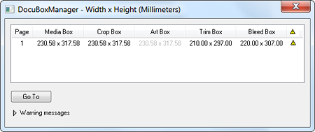
There are other tools like PitStop that can show page dimensions. I prefer the handy overview shown below, which was generated by the DocuBoxManager plug-in. It is part of the Agfa Graphics Apogee Prepress workflow.
This Apogee Prepress plugin for Acrobat shows page box dimensions

General rules regarding page boxes

  • Each page in a PDF can have different sizes for the various page boxes.
  • The page boxes are always rectangular. That may seem logical but artwork is not always rectangular: a PDF can represent an oval label or the foldout of a cardboard box.
  • A PDF always has a MediaBox definition. All the other page boxes do not necessarily have to be present in regular PDF files.
  • The above rule is not true for the PDF/X file formats:
    • PDF/X-1a and PDF/X-3 compliant files need to include the MediaBox, TrimBox, and BleedBox.
    • PDF/X-4 files need, next to the MediaBox, a TrimBox or an ArtBox, but not both. The ArtBox or TrimBox cannot be larger that the BleedBox. If a CropBox is present, the ArtBox,  TrimBox, and BleedBox need to extend beyond its boundaries.
  • The MediaBox is the largest page box in a PDF. The other page boxes can equal the size of the MediaBox but they are not expected to be larger (The latter is explicitly required in the PDF/X-4 requirements). If they are larger, the PDF viewer will use the values of the MediaBox.

How to change page boxes

You can use the Crop Pages tool in Acrobat Professional to change the page boxes.
A number of plug-ins offer more sophisticated controls to change bounding boxes. Enfocus PitStop isn’t too bad but again I prefer the Agfa DocuBoxManager plug-in. If you know about other interesting plug-ins or tools, add a comment to this page.
What you should not do is rescale a PDF by placing it on a page in a layout or drawing application like InDesign or Corel Draw and then rescale it. This is called ‘PDF refrying‘ and while it may work, there are disadvantages making it a procedure that many frown upon.

Do I even need to worry about all these boxes?

Nowadays applications are PDF-aware enough that they get things right from the start. Take Adobe InDesign for example:
  • BleedBox information is sourced from the bleed settings in the marks & bleeds section of the print dialog box.
  • The TrimBox is taken from the document setup.
  • The MediaBox size is defined by the media size to which you print. If the “paper”-size width and height are set to automatic, the MediaBox size will be equal to the BleedBox size.
  • The CropBox size is set to be the same as the Media size.
In the past you had to pay attention a lot more. Older applications did not define the trim box properly, forcing most prepress operators to center pages and hope everything worked out fine (which it usually did, by the way).

I want to see the finished trim size of a PDF

To view a PDF at it’s finished (trim) size, set the CropBox to match the TrimBox. Some systems do this by default. This has users who are not familiar with PDF worry if there is any bleed in the document. They do not realize that there may be information available which simply isn’t visible on-screen. Acrobat plug-ins such as Enfocus PitStop allow you to alternate the PDF view between TrimBox and MediaBox.

Errors referring to the BBox

Within PDF files there is another box, the bounding box or BBox, that is used. The bounding box is a rectangular frame that determines the dimensions of an object (such as a graphic, font or pattern) that is placed inside a PDF document. As such, this box has nothing to do with the page boxes. Due to bugs in PDF creation or viewing tools,  errors that refer to a BBox may pop up when an application processes a PDF. A typical example is ‘The Font “ArialMT” contains a bad /BBox’.


Even though PDF is a reliable file format, things can still go wrong when processing PDF files.

  • Sometimes a PostScript error pops up and a PDF file cannot be output.
  • Acrobat occasionally doesn’t seem capable of displaying the file correctly.
  • There can be inconsistencies between the output and what a PDF looks like on-screen.
  • Older software may not be capable of handling the features of the latest PDF versions.
A frequently used trick to try and get around such problems is ‘refrying’ the PDF file: converting a PDF to a PostScript file which is then converted to PDF again. This ‘second generation’ PDF file often does not exhibit the problems with the original source file.
Some people print the original PDF to a PostScript file and then distill that file. Others are firm believers that you should export to PostScript from within Adobe Acrobat and then convert that file to a PDF again. Both the Print and Export menu options actually use exactly the same software routines in Acrobat so it does not really matter which method is used.

Other reasons to refry PDF files

Some users refry PDFs because of the way they process data:
  1. PDF-based advertisements are placed on InDesign or QuarkXPress pages.
  2. These pages are printed to a PostScript file.
  3. This file is sent to Acrobat Distiller or another PDF creation tool.
It is not always apparent to users if a PDF file goes through an intermediate PostScript phase: if a PDF is placed on a QuarkXPress, PageMaker or FrameMaker page which gets exported to PDF, that PDF gets refried because these layout applications internally always converts PDF to EPS (Encapsulated PostScript).
Last but not least: some people refry every single PDF they process, either because one of the above reasons forces them to do so or because refrying solved a few problems in the past and now they assume it won’t hurt to do it all of the time.

Is it a good idea to refry PDF?

As a way of troubleshooting files: YES, but check the remainder of this page to avoid creating more problems than get solved.
As a fixed part of your workflow, even though there is no technical reason for doing so: NO! Not only are you wasting system resources but each transformation brings along the risk of data loss or something going wrong.

What can go wrong when refrying PDF files?

PostScript is an older file format than PDF. The differences between both systems cause some transformations when refrying PDF files.
  • When it comes to color management, PostScript is CIE-based whereas PDF relies on ICC profiles. As long as you are working with CMYK-based PDF files (which probably account for over 90% of all PDFs out there), there is no need to worry about color shifts or changes when going from PDF to PostScript and back. If a PDF however contains color managed data (e.g. it is a PDF/X-3 file), the conversion to PostScript forces a conversion from ICC to device or CSA based colors. The current Adobe applications use a work-around to preserve the ICC profiling data. They embed the ICC-profiles in DCS comments which can be picked up by Distiller again when converting from PostScript to PDF. Other or older applications are not that clever and colors may change when refrying PDF files.
  • Since PostScript doesn’t support transparency, refrying PDF files implies that the second generation PDF won’t contain any transparency. That means this file may be larger and can’t be edited as easily any more. Nowadays both Adobe and Global Graphics ship renderers or rips with full support for transparency. It is a shame not to use that capability and revert to flattened PDF files.
  • Both PostScript 3 and PDF 1.3 & later support a mechanism called smooth shading which offers higher-quality monochrome or color gradient fills. Older versions of PostScript as well as the EPS file format don’t support smooth shading. This means that gradients are transformed when converting from PDF to EPS or PostScript level 2. This may lead to banding or thin white lines in the gradient.
  • A minor inconvenience for prepress users is the fact that a number of PDF features such as annotations, forms, hyperlinks, movies or bookmarks won’t survive the transition to PostScript.
  • There are some lossless compression algorithms that are supported by PDF but not by PostScript. Refrying a PDF file that uses such an algorithm can lead to significantly larger files. This can also happen with PDF files in which JPEG2000 compression is used. This algorithm is more efficient than the regular JPEG compression that is supported by PostScript.
  • I have never encountered PDF files with 16-bit images in them besides the ones that I created myself when playing around with that feature. Those 16 bits won’t survive refrying. A refried PDF always contains 8-bit data because that is all that PostScript can handle.
Incorrect settings can affect the refried PDF
  • Both the settings used to export a PDF to PostScript and to distill or normalize that PostScript file back to PDF affect the quality of the refried PDF. If Distiller is set to downsample images or recompress using a low quality JPEG setting, this can obviously affect the quality of images.When exporting or printing to a PostScript file, make sure to use the following settings:
    • PostScript: select “Language Level 3”.
    • Fonts: deactivate any option that converts fonts & make sure all fonts are embedded.
    • Color management: deactive it (“Same as Source” option in Acrobat 8).
    • Transparency: set the Flattener Preset to “High Resolution”.
    In Distiller or any other PDF tool that is used to create the second generation PDF file, use the following settings:
    • Images: deactivate downsampling & don’t try to compress the images too much. Activating the “Save original JPEG images in PDF if possible” option in the Advanced settings of Distiller 8 is a good idea.
    • Color management: deactive it (“Leave color unchanged” option in Distiller 8).
  • Due to incorrect settings, fonts may get converted to another font format or they may get renamed and subsetted. There is always the risk of losing part of the editability of the file because the Acrobat Touch-up tool doesn’t work that well with a refried PDF.
Software bugs
  • Every time data are transformed, there is a risk of losing or damaging something. Some font related issues which may pop up when refrying PDFs or merging multiple PDFs in a single file are related to software bugs. Characters that vanish, get replaced by others or appear as small square rectangles are typical examples of bugs in applications that do not properly handle the merging of font subsets. This is actually the most fearsome problem in any workflow in which PDF files are reprocessed. Imagine the first digit of prices in a catalog being replaced by spaces! I once heard of a printer having to reprint an entire series of math books because a few obscure characters with an important mathematical significance somehow got replaced by other funny looking characters. No prepress operator can catch such an error (unless you happen to be a math buff with time to spare to check hundreds of page proofs).

Alternatives to refrying

Try correcting the original PDF file instead of using the more drastic refrying procedure. This is both faster and the risk of losing or altering data is lower.
  • From Acrobat 6 onwards, Acrobat Professional has a ‘PDF Optimizer’ function which can do a good job of cleaning up a file. In Acrobat Professional 8, this option can be found in the ‘Advanced’ menu option.
  • Third party preflight tools or optimisation tools may also be able to solve the problem. Enfocus PitStop, Callas pdfCorrect & Apago PDF Enhancer are examples of such tools.


Technical design aspects

  • Bleed
  • Dot gain
  • File formats
  • Image resolution
  • Points & other measurement units
  • Reversed type
  • Rich black
  • Total ink coverage
  • Vector versus bitmap images
This page provides an interesting overview what the top 10 issues with digital files. I guess that reading my optimizing documents page is a good summary on how to avoid those problems.
Preflighting is a technique that is used to validate if a document meets the correct requirements. My page on how to preflight PDF files also contains useful recommendations for working with other preflighting tools.

Creative aspects

  • Lorem ipsum dolor sit amet…
  • The psychology of colors
  • The best typefaces for print
  • The most disliked fonts
Powered by Blogger.